Exploring Unique Embroidery Color Palettes: A Guide to Creative Expression
Exploring Unique Embroidery Color Palettes: A Guide to Creative Expression
Introduction
Embroidery is a timeless art form that combines creativity with textile craftsmanship. One of the most exciting aspects of embroidery is the use of color palettes, which can transform a simple design into a stunning masterpiece. In this article, we will delve into unique embroidery color palettes that can inspire both beginners and seasoned artisans alike. The world of embroidery is vast, and understanding how to effectively incorporate color can set your work apart.
What are Color Palettes in Embroidery?
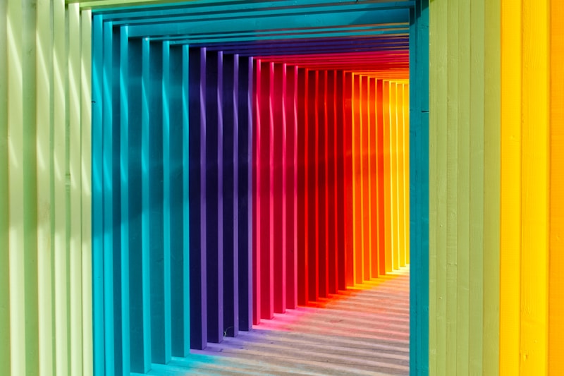
A color palette in embroidery refers to the selection of colors used to create a design. It plays a pivotal role in how the final product is perceived. The right combination of colors can evoke emotions, convey messages, and enhance the aesthetic appeal of the artwork. Some key factors to consider when selecting your color palette include:
- Theme of the design
- Target audience
- Personal preferences
- Cultural significance of colors
Types of Embroidery Color Palettes
There are several types of color palettes that can be employed in embroidery projects. Here, we explore some popular styles:
| Color Palette Type | Description |
| Monochromatic | Utilizes variations in lightness and saturation of a single color. |
| Analogous | Combines colors that are next to each other on the color wheel, creating harmony. |
| Complementary | Involves colors located opposite each other on the color wheel, providing contrast. |
| Triadic | Incorporates three colors evenly spaced on the color wheel for balance and vibrancy. |
| Pastel | Features soft colors that create a gentle and soothing aesthetic. |
Choosing Your Unique Color Palette
Selecting a unique color palette involves more than just randomly picking colors. Here are some tips to help you curate a stunning embroidery color palette:
1. Understand Color Theory
Familiarize yourself with the basics of color theory. Knowing how colors interact, complement, and contrast will give you a solid foundation for creating stunning palettes. For instance, warm colors (reds, yellows, oranges) can evoke feelings of warmth and excitement, while cool colors (blues, greens, purples) often give a sense of calm and tranquility.
2. Test with Swatches
Before committing to a color palette, create swatches to see how the colors work together. This is especially important due to the variations in material and stitching techniques. Thread colors might look different when stitched, so sample your design on fabric to gauge the final result.
3. Look for Inspiration
Draw inspiration from various sources. Nature, art, and interior design can all offer ideas for unique color palettes. For example, a sunset can inspire a palette of oranges, purples, and pinks, while a serene forest might suggest greens and browns.
Popular Unique Embroidery Color Palettes
To spark creativity, here are a few popular unique embroidery color palettes you might consider:
Bohemian Vibes
This palette blends earthy tones with vibrant colors. Think burnt orange, deep teal, mustard yellow, and rich burgundy. Use this palette for free-spirited designs, often emphasizing nature.
Ocean-Inspired
Inspired by the vastness of the sea, this palette includes shades of blue, aqua, coral, and sandy beige. It’s perfect for seaside themes or nautical motifs, transporting the viewer to a beach setting.
Floral Elegance
The floral palette incorporates soft pinks, lush greens, and subtle pastels. This palette works beautifully for delicate floral embroidery, evoking romance and charm.
Modern Minimalism
With this palette, less is more. Black, white, and gray dominate, allowing for striking geometric designs. Ideal for modern decor, this palette emphasizes simplicity and elegance.
Tips for Applying Color in Embroidery Techniques
Applying your chosen color palette effectively can greatly influence the outcome of your embroidery project. Here are some essential tips:
1. Layering Colors
Experiment with layering different shades and colors in your embroidery. This technique adds depth and dimension to the embroidery, making it visually captivating.
2. Contrast for Impact
Use contrasting colors strategically to highlight specific elements of your design. Contrast draws the eye and can enhance focal points in your embroidery piece.
3. Consistency Across Projects
If you plan to create a series of embroidery pieces, try to maintain a consistent color palette. This helps create a cohesive look in your work and can also establish your unique artistic identity.
Conclusion
Embroidery is a powerful medium for artistic expression, and the choice of a unique embroidery color palette is crucial to the outcome of your work. By understanding color theory, sourcing inspiration, and applying your colors thoughtfully, you can elevate your embroidery projects to new heights. Remember, your palette should reflect your vision and resonate with your audience. Experiment, have fun, and embrace the beauty of colors in your embroidery journey!
Final Thoughts
As you embark on your embroidery journey or refine your skills, remember that color has the power to transform your artwork fundamentally. Be bold in your choices and allow your unique style to shine through your palettes. Happy stitching!
