Nature's Palette: Incorporating Natural Colors in Design
Nature's Palette: Incorporating Natural Colors in Design
Introduction to Nature's Palette
Exploring the concept of Nature's Palette involves diving into the vibrant and soothing colors found in the natural world. As we strive to incorporate these colors into our design projects—be it interior design, fashion, or digital art—understanding the significance of natural colors can greatly enhance our aesthetic appeal and emotional connection to our creations.
The Significance of Natural Colors
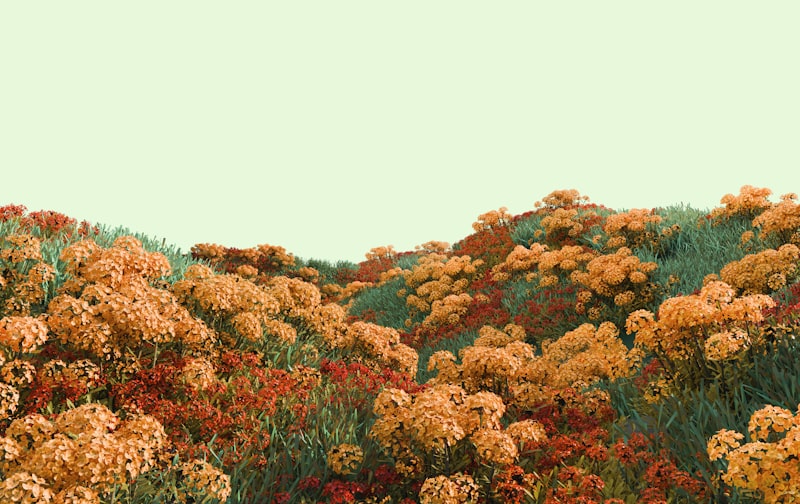
Natural colors evoke feelings of tranquility, harmony, and balance. They allow us to reconnect with nature, providing a sense of calmness in our often chaotic lives. Nature's Palette consists of a wide array of shades inspired by Earth’s elements. From the lush greens of forests to the soft blues of the ocean, these colors can influence our mood and can be effectively utilized in various design contexts.
Key Elements of Nature’s Palette
When considering how to incorporate natural colors into your designs, here are some key elements to keep in mind:
- Nature-Inspired Color Schemes: Selecting colors that mirror the environment, such as earthy browns, forest greens, and sky blues.
- Seasonal Changes: Understanding how colors change with the seasons can allow for unique and timely designs.
- Textures and Materials: Combining natural colors with corresponding materials (like wood, stone, or textiles) to enhance the overall look.
How to Utilize Natural Colors in Different Design Fields
| Field | Natural Color Applications |
| Interior Design | Incorporating natural color palettes through wall paints, furnishings, and décor items that reflect the outdoors. |
| Fashion Design | Using fabrics dyed with natural colors or patterned after floral and botanical inspirations. |
| Graphic Design | Creating backgrounds that feature gradient colors inspired by sunset skies or emerald landscapes. |
Emotional Impact of Natural Colors
Natural colors have profound psychological effects. For instance, green is often associated with growth and tranquility, while blue represents calmness and reliability. Understanding how these colors impact our emotions can help designers create spaces and products that resonate with their audience.
Practical Tips for Using Natural Colors in Your Designs
- Choose a Focal Point: Start with one main color from nature and build your palette around it.
- Combine with Neutrals: Pairing natural colors with neutral shades can create balance and enhance the vibrancy of your primary colors.
- Test in Different Lighting: Colors can appear differently in various lighting, so always test your selected palette in the intended environment.
Common Questions about Incorporating Natural Colors
1. What are some examples of natural color palettes?
Some popular natural color palettes include earthy tones such as terracotta, deep greens, soft blues, and muted yellows. For example, a palette inspired by a serene forest may include olive green, moss brown, and soft beige.
2. How do I choose the right natural colors for my space?
Consider the purpose of the space and the atmosphere you wish to create. For a calming bedroom, lean towards cooler tones like soft blues and greens, while a lively kitchen might benefit from vibrant yellows and warm earthy tones.
3. Can I use too many natural colors in one design?
Yes, while incorporating multiple natural colors can create a dynamic environment, overdoing it can lead to visual confusion. Strive for a balanced approach that allows for breathing space while still showcasing the beauty of nature’s colors.
Conclusion
Incorporating natural colors into your design endeavors not only enhances aesthetic appeal but also connects us to the environment in profound ways. Nature's Palette allows us to draw inspiration from the world around us, fostering tranquility and beauty in our creations. Remember to embrace the emotional impact of colors and experiment with different combinations to find what resonates most with you and your audience. Whether you are refreshing your home decor, designing apparel, or creating immersive digital experiences, the palette of nature awaits discovery.
As a final note, always consider the context in which your designs will be viewed and used. Natural colors can vary widely depending on the surrounding elements and lighting conditions; thus, vigilant testing and adjustment are key to achieving the desired effect. So go ahead, explore Nature's Palette, and let the vibrant colors of the earth enrich your designs!